

In Holland, nothing ever happens. Today – I’m writing this on Friday, October 21th – our main headlines are: repairs for a bridge across a wide river; slow traffic because of an accident; the extradition of three people suspected of manslaughter; something about steel prices, and something about manure surpluses. The stock exchange has been stable for some three months and our best weather forecast is “tomorrow the same as today”.
This is not a country of warfare, terror, murder or bloodshed. At least not for some time now. Four centuries of comparative peace have produced some pretty good chocolate, a particular kind of cheese, a lot of windmills, and radical enlightenment.
Over the centuries we’ve had our share of artists as well, of course. I won’t go so far as claiming there is something like a “Dutch school”, yet I wouldn’t be surprised if art historians will one day recognize a certain “Dutchness” in the work of Dick Bruna, Joost Swarte, Piet Mondriaan and Pieter Saenredam.
Nijntje
Below is Miffy, a rabbit designed by an illustrator named Dick Bruna. In Dutch, she’s called “Nijntje”, which means as much as “little rabbit”. Every Dutch child knows her: there’s a plethora of Miffy books, Miffy pillows, Miffy furniture and Miffy games. We even have a Miffy Museum. As Donald Trump would say: “She’s huge.”
Simple as she may look in her minimalism, looks can be deceiving. Just imagine one line being placed differently – her facial expression would be completely different.
I cannot imagine something more difficult to create than something as simple as Miffy, and I greatly admire Dick Bruna for it.

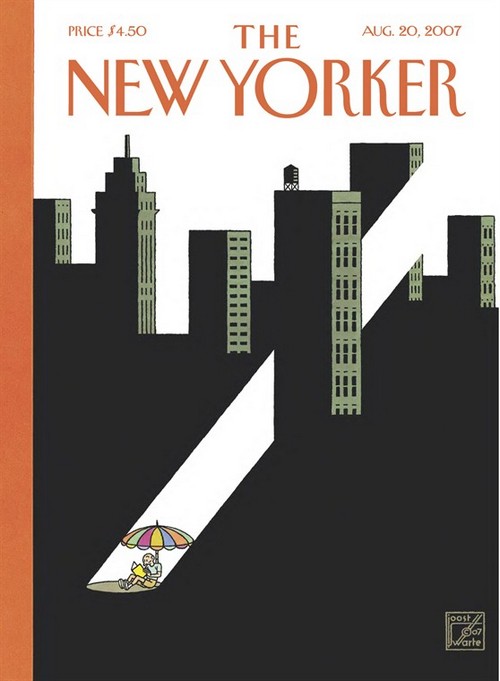
Bruna, however, is not the only one who loves this artificial simplicity. Below is an illustration by Joost Swarte, who named this style the “clear line”. It is easy to recognize: strong colors, lines of the same width, no hatching.
Mondriaan
Here’s a third example, this time from the world of highbrow art: Piet Mondriaan or, as he preferred to call himself, Piet Mondrian (an anagram of “I paint modern”).
Again, notice how this painting looks exceedingly simple on the surface, but is far from it. In fact, the supposed simplicity of Mondriaan’s style has been the subject of some scientific scrutiny.
A bunch of researchers once programmed a computer to create something similar, using only white and primary colors, rectangles and black lines. Ordinary people were then alternately shown actual paintings by Mondriaan and the computer generated imitations in random order. They were able to point out the originals with an astounding degree of accuracy.
The difference: Mondriaan’s work exhibits an almost tangible tension. Like with Miffy mentioned above: one only has to move one line and all is changed – in this case, one loses a certain subtle yet noticable tension.
Saenredam
I will not claim that the Dutch are unique in creating this type of clarity, but we do have a lot of experience with it. Here is an example from the seventeenth century, by a painter named Pieter Saenredam.

Just imagine that the artist would have moved his position five meters to the right: the painting above would not have the same balance, there would be no tension at all. The resulting picture would be quite boring to look at.
I might tell a similar story about architects like Gerrit Rietveld, Mecanoo, or Claus & Kaan. Their work too exhibits a kind of artificial simplicity I haven’t often encountered abroad.
A foreign journalist whom I have the pleasure of knowing for a number of years now, once relayed his conviction to me on how this perspicuity seems to permeate every aspect of Dutch culture, including our food and our quasi-nonchalant manners (which one might also call “direct”, “blunt” or “rude”).
He firmly believes it is the key to understanding the Netherlands and Dutch people; which is why I’ve opted to write this in English. One never knows: somebody might find it useful.
“Quasi nonchalant manners”; c’est une vraie trouvaille, Monsieur ! Alors, les Néerlandais ont des manières quand même : -]
Bij het woord extradition veerde ik op: iemand weggestuurd/uitgeleverd wegens (poging tot) doodslag. Maar bij het aanklikken blijkt, dat het de buren zijn die 3 Roemenen aan ons terug leveren. Dus eerder een kwestie van intradition dus.
Merci beaucoup les Flamands.
De rien.
Wat is er zo Dutch aan Hergé? Swarte is meer bekend om z’n design dan om zijn strips (noem eens uit je hoofd een titel van hem…). Mondriaan maakte ook de Victory Boogie Woogie, ook in de Stijl-stijl maar nog steeds simplicity?
Ik denk dat je simplicity als gemeenschappelijke noemer vooral hebt gevonden door al het andere weg te laten. Het lijkt me dan ook eerder je eigen voorkeur dan iets typisch Nederlands. Zoals de simplicity van de Ramones.
So..why in English?